


_white.png)
The Therapeutic Workshoppe
Services
> Strategic Brand Direction
> Logo & Visual Identity
Year
2024
The Craving
Speech and language therapist and educator, Dr. Keisha Nurse, came to us with a brand name that meant a lot, and the desire for a visual identity that matched. As the only PhD-level clinician of her kind in the Caribbean region, she needed a professional, approachable brand that could grow alongside her vision. The goal was to better connect with parents, caregivers, schools, and future collaborators across the Caribbean and U.S.A.

PREVIOUS LOGO
The Missing Ingredients
The previous logo included a literal house illustration, which, while meaningful, felt a bit limited in its versatility. It didn’t translate as effectively across professional materials and didn’t embody The Therapeutic Workshoppe’s role in clinical care, education, and capacity building.
The Recipe
Dr. Nurse wanted a brand identity that reflected both her clinical expertise and her warm, human-centered approach to care that offered practical tools (hence, "Workshoppe").
Aligned with her vision, we focused on positioning The Therapeutic Workshoppe as a trusted space for speech and language therapy, professional development, and family support. The brand needed to establish trust and credibility without feeling sterile, and resonate with both parents and professionals.


LOGO DEVELOPMENT


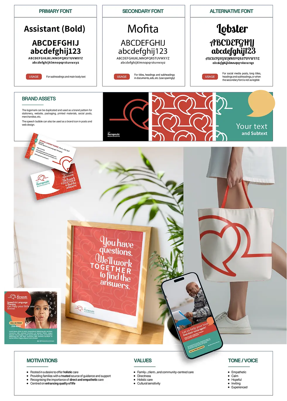
COLOR PALETTE
These colors were chosen to convey compassion and hope with a bright yet calm, inviting feel that is professional yet approachable.
The Baking
We explored symbolism related to communication, growth, and support, avoiding clichés like handprints or exaggerated speech icons. Drawing from imagery like toolkits, hearts, and rising paths, we developed a brand direction that felt both comforting and authoritative.
The new logo distills the essence of The Therapeutic Workshoppe into a thoughtful, memorable symbol that merges a heart and speech bubble, symbolizing both communication and compassionate care. The shape also resembles a sunrise, capturing the hope and progress that families seek through therapy.


COLOR PALETTE
These colors were chosen to convey compassion and hope with a bright yet calm, inviting feel that is professional yet approachable.
.png)
The Frosting
The soft, uplifting palette of rose, teal, and warm neutrals reinforces the sense of hope and encouragement, while the rounded sans-serif typography adds youthfulness and approachability.

The brand voice is calm, empathetic, knowledgeable, and hopeful, helping Dr. Nurse guide patients and their families while building trust and emotional connection.


The brand system was extended across printed materials and digital templates, giving The Therapeutic Workshoppe the consistency and polish it needs to continue growing.
The result is a brand that feels professional yet warm, clinical yet personal... exactly the balance needed to reflect the quality and care at the heart of the practice.
Client Testimonial.

"Fantastic process to help a brand owner understand who they are and how they want to present themselves."
- Dr. Keisha Lindsay Nurse, The Therapeutic Workshoppe


